The Challenge
The Central Texas Dachshund Rescue website is one of the two main resources the organization uses to get their pups fostered and adopted. However, the CTDR website is unable to help users on their journey to support the org, or find a pup to adopt.
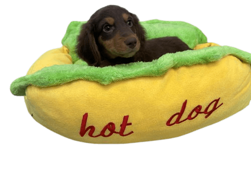
Every year there are over 25,000 dogs looking for forever homes in the state of Texas.
Every user struggled finding the org FAQ, or a “help” resource
83% of users were confused by lack of visual hierarchy
4 of 5 users left before completing the lengthy adoption form
Key Redesign Features
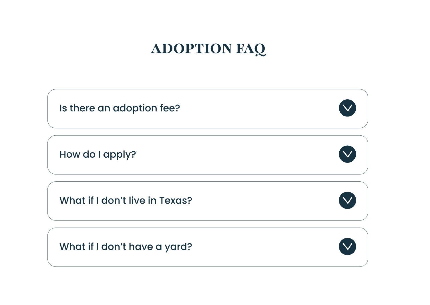
An FAQ page users are familiar with
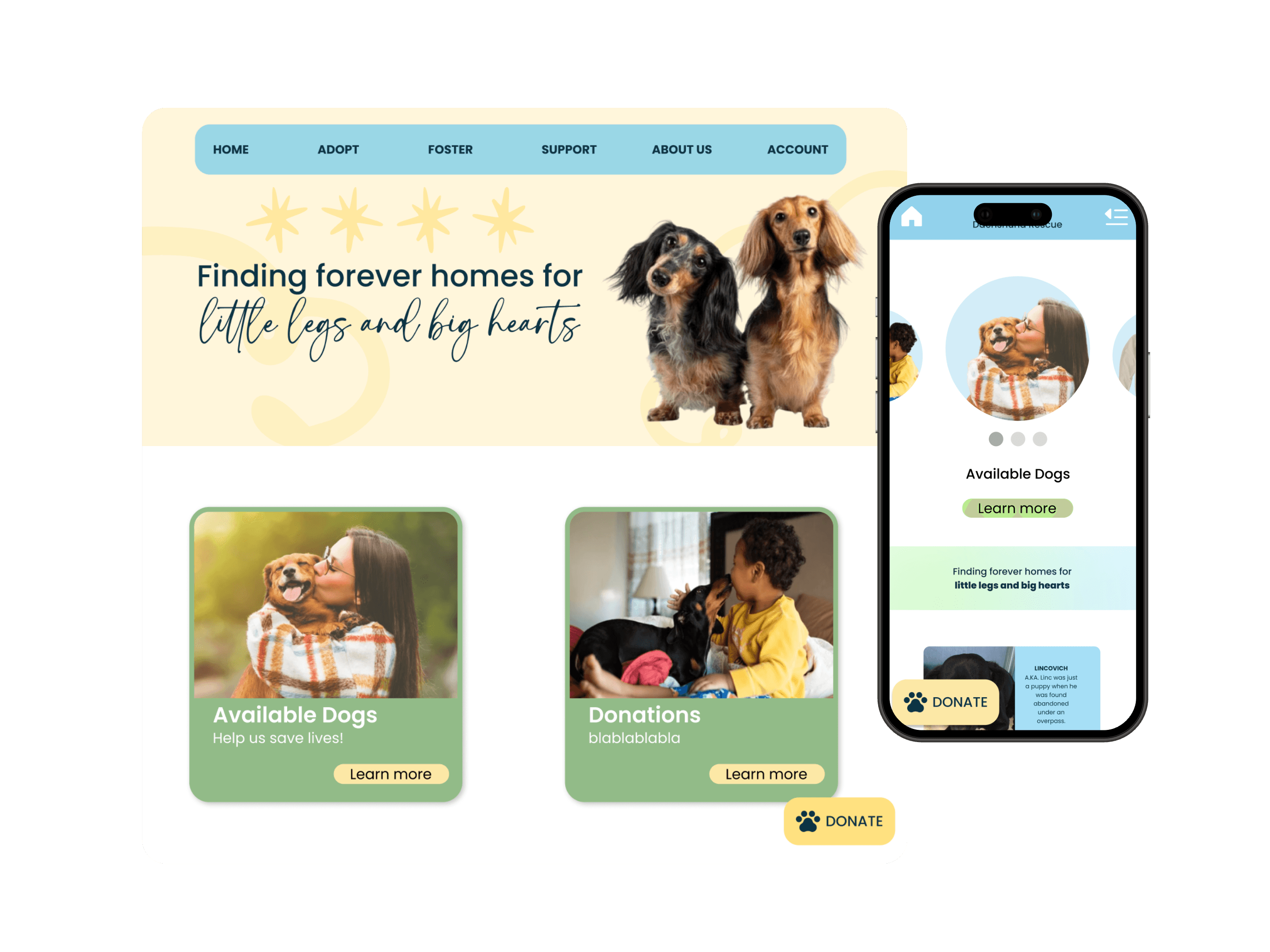
Approachable design with intuitive top navigation
Floating donation button to increase engagement
Walls of text cut in half with concise summaries
User Needs and Goals
Conducting user research
5 Interviews conducted
10+ hours
secondary research
17 survey responses
The Process
Secondary Research
Interviews and Surveys
Synthesizing Data
Prototypes
User Testing
Results
Opportunities
Ideation
1/5 CTDR Vice President
1/5 CTDR Volunteer
1/5 Adopted their dog from CTDR
Content Inventory
Content Audit
Proto Personas
Priority Matrix
User Journey
Medium Fidelity Desktop
High Fidelity Desktop
Low Fidelity App
A/B testing to determine which donate feature is most effective
100% Donation Engagement
Information Architecture
CTAs
AI assistance
Competitive Analysis
11 articles
Social Media discussion forums
Medium Fidelity Wireframes
We tested “donation” modals appearing on every page our user clicks into.
Testers reported feeling “fatigued” by the overlays and said they were reminiscent of ad pop-ups.
We removed pop-ups on every page and replaced them with static banners. We also found the “Donate Today” button was more effective on it’s own.
The Magic
The Decision
The Setback
We kept the navy blue, sky blue, green, and yellow. We made each of the colors pastel to convey a gentle and friendly tone.
High Fidelity Design System
Design DNA
Accent
#E3F8D1
Accent
#FDE8A6
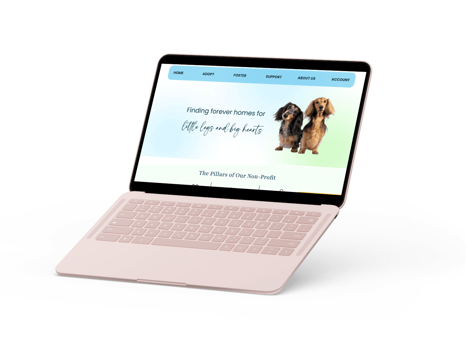
Central Texas Dachshund Rescue
Main
#8DDAF7
Secondary
#FFC100
Main
#B6E390
Heading
Playfair Bold | 48
Header
Poppins Medium | 48px
Body
Poppins Rgular | 24
Secondary
#0C3444


If fostering isn’t an option right now,
you can support CTDR with a gift
DONATE TODAY
Dog Name - Age
Learn more
DONATE NOW
DONATE NOW
DONATE NOW
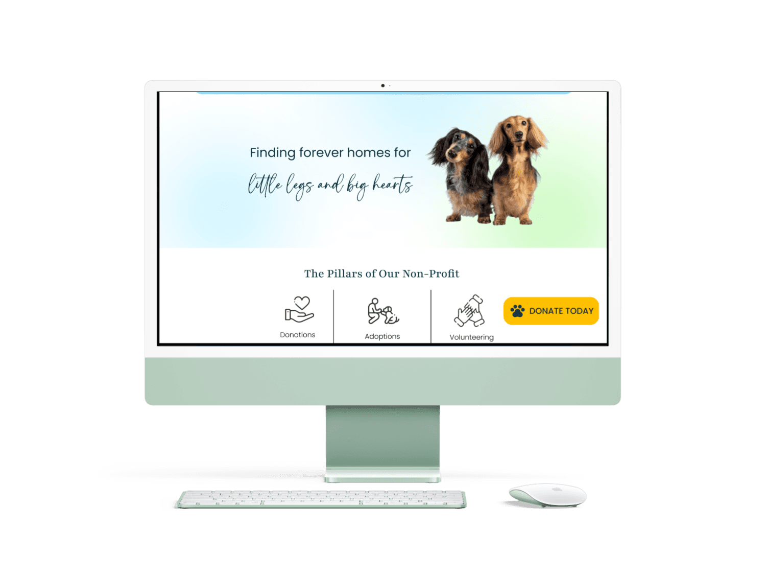
HOME
ADOPT
FOSTER
SUPPORT
ABOUT US
ACCOUNT
RETURN
RETURN

search keywords
Apply Today
Apply Today
DONATE
DONATE
My Role
Lead Designer
UI/UX design
Branding
User research
Research analyst
Tools
Figma
FigJam
Duration
4 weeks
Long Story Short...
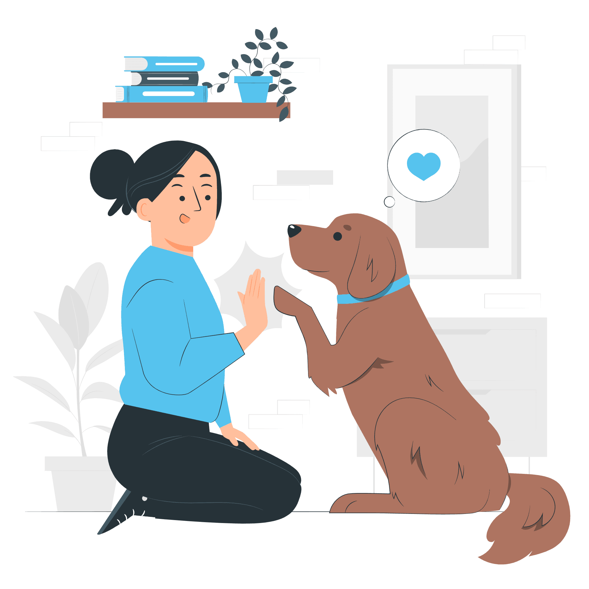
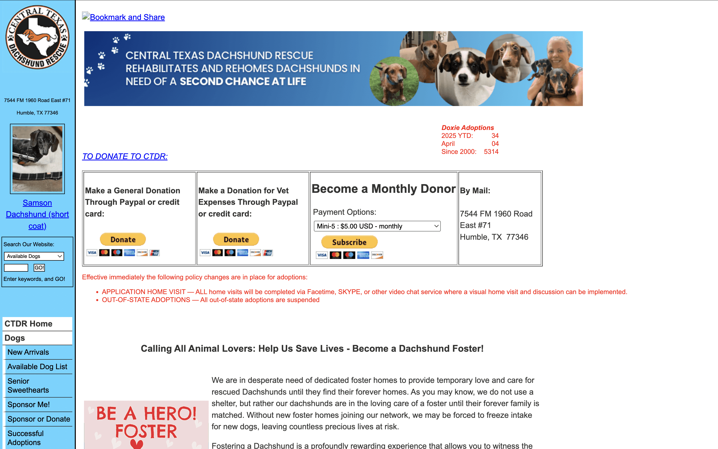
Central Texas Dachshund Rescue was founded in the year 2000, and has placed over 5,000 foster dogs with their forever homes. I was on a team of three people, and within four weeks we redesigned key elements of the website to suit the requests of the CTDR Vice President.
The Problem
No clear calls-to-action
Lengthy paragraphs with no breaks
Navigation displaying 28 pages
No visual hierarchy
Adoption form fill in the blank only
The Solution
Clear calls-to-action with contrasting colors
Remove redundant language, and add visual element to break up text.
Dropdown navigation with 6 categories
Visual hierarchy through typographic design system
Adoption form with radio buttons, and collapsable question components to break up fill in blanks.
Our team focused on three touch points: donations, adoption, and fostering with an emphasis on donations. We recognized that adoption and fostering involve more personal and emotional decision-making and felt we could make a more immediate impact by streamlining and simplifying the donation process.
From Ideas to Interface
The Design Process
Our #1 goal with this redesign was driving donations and recurring gifts from users
The Good, the Bad, and the Infinite Scroll
Dissecting the original website
The homepage navigation inundated users with the left-aligned sidebar displaying links to all 28 pages. Our team also conducted a content inventory and audit found 8 redundant pages.
More than 80% of users said they were overwhelmed by the OG website’s lack of visual hierarchy
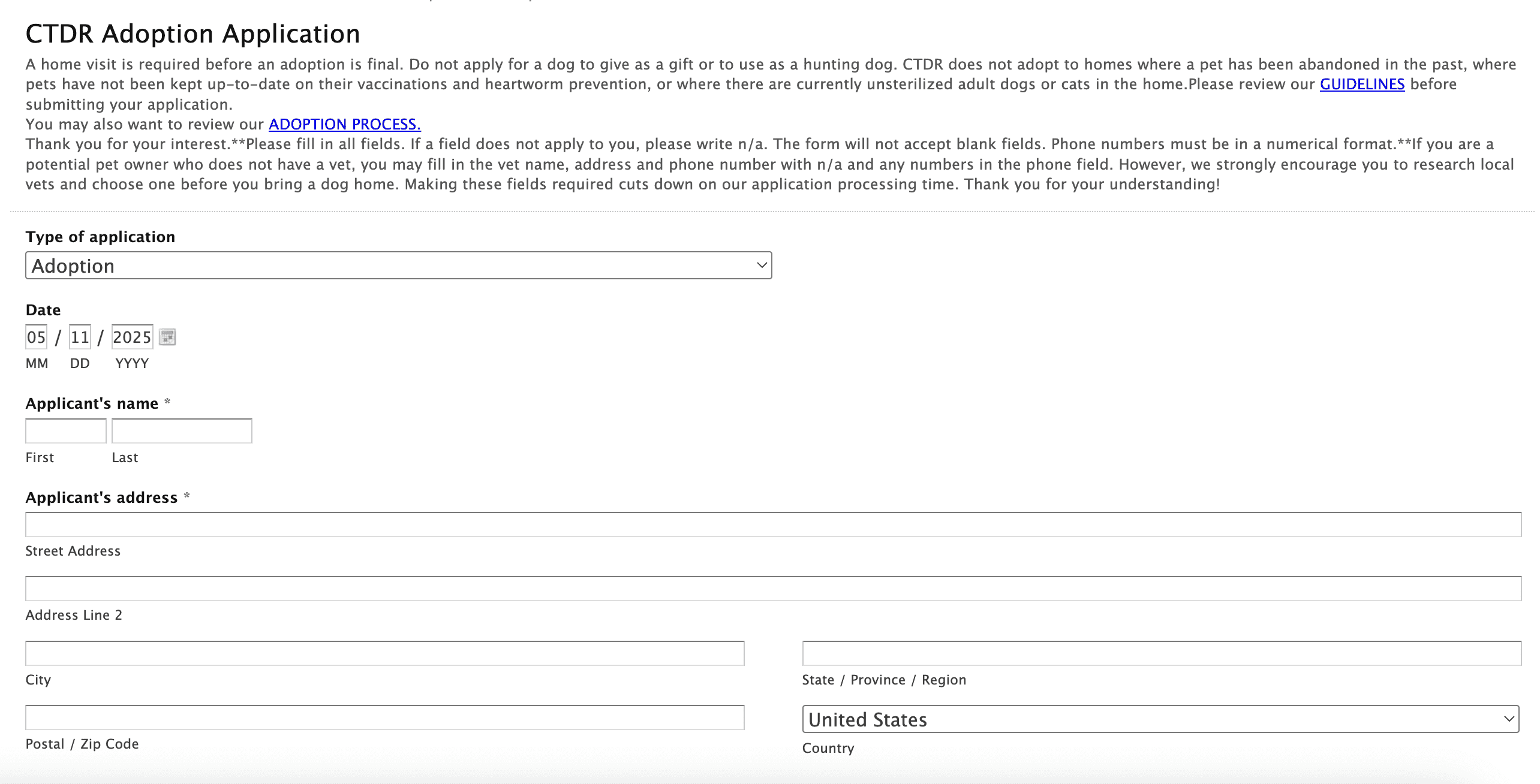
The 92 question adoption form that chased 4 of our 5 users away
The adoption form is 92 questions long, and 79/96 entries were fill-in-the-blank.
Design DNA
Creating the Design System
Color
Main
Secondary
Main
Accent
Secondary
Accent
CTDR Visual Identity
Compassionate
Brand Personality
Typography
Accent
Headings
Body
The quick brown fox jumps over the lazy dog
Santa Catalina 24pt Regular
The quick brown fox jumps over the lazy dog
Playfair 16pt Medium
The quick brown fox jumps over the lazy dog
Poppins 14pt Regular
Through our competitive analysis we found three common colors used by adoption agencies were blues, greens, and yellows.
We honored the original navy blue in the logo, and added another blue to soften the navy.
Low/ Medium Fidelity Design System
From 92 questions to 15
Adoption form sliced in half
and then sliced in half again
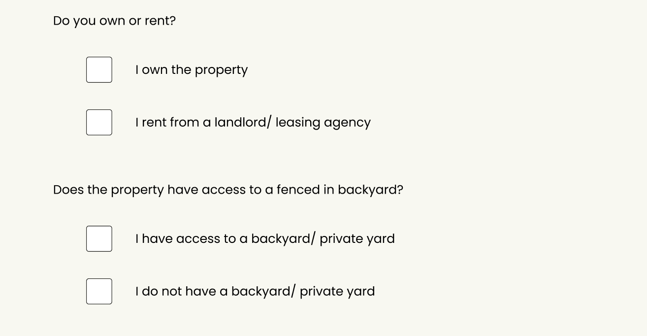
Our team noticed many of the questions were repeated or redundant. We reduced many of the questions, or combined them into one.
We made more options with single choice drop downs, and radio buttons to reduce user fatigue while answering questions.
pages located - “Adoption Application” and “Foster Application”
Dude, Where’s My Donation?
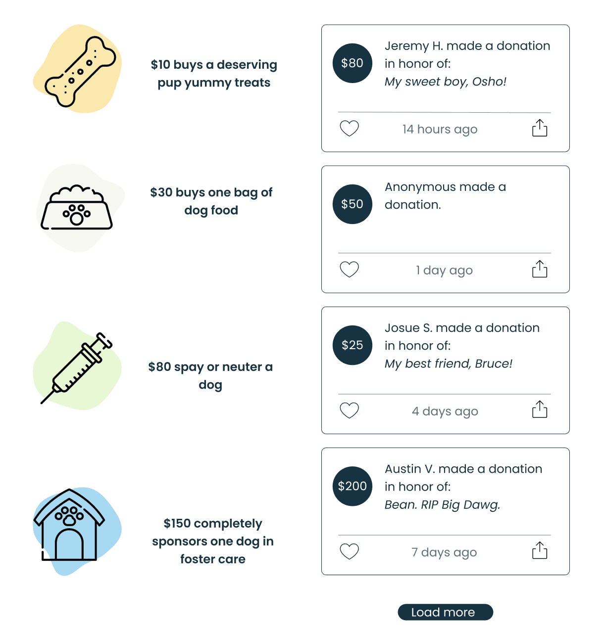
Where does the money go?
Our team collected data and found two main points of friction for users considering donations, but who didn’t pull the trigger:
Users want an idea of what their gift is spent on
They want to know if they’re donating “enough”
With little illustrations, and large text, we made it clear before the user entered their card/ PayPal information what their gift would be used for.
page located - “Donate”
Results and Impact
The team’s main priority was to encourage donations, and monetary support. Other positive results fell into place with our intentional design choices to make adoption, and fostering processes more clear, and create a modern looking website with navigation most users are already familiar with.
100% of users found the help resources, and FAQ page
75% of users clicked the donation page upon entering the website
5 of 5 users found the new adoption form easy to digest and fill out
We wanted to include more color to really set ourselves apart from the original website which was mostly white with sky blue
Our testing revealed the colors made it hard for users to identify the CTA’s on the homepage, and made the “donate” button tough to spot.
We made the green and yellow CTA colors exclusively, and left the original sky blue as the primary color now paying homage to the original website
The Magic
The Decision
The Setback
Reflection
The team and I were very focused on what the Vice President of the non-profit wanted. We should have conducted more interviews with users about the original website before we began the design process. We took what the VP said and ran with it, and went back to edit ideas later.
In the future, I would get more people’s input and use those notes instead of working in isolation.
What did I learn from the process and what would I change?
The Foundation
Time Management
The team was excited about the possibilities of adding new features to the website, and adding a companion app but found this took too much time. We spent time focusing on the vegetables in the stew when the meat and potatoes needed more attention.
Ideas we started and had to leave behind:
AI assistance bot
Companion App
Doggie Quiz
The team and I focused heavily on A/B testing strategies to increase donation engagement. In hindsight we should have conducted broader user testing. Our emphasis on donations meant other key areas, such as color scheme, site organization, and user flows were not tested as thoroughly as they should have been.
User Testing
We broke up large bodies of text with fun illustrations
We added a collapsable FAQ panel
Alleviating the volunteer’s workload
The original “adoption process and feed page” was 700+ words long, no breaks in the paragraphs, and no illustrations. The information was also not categorized in an intuitive way, forcing users to read/ skim all 3,493 characters to find a single answer.
Our volunteer had stated most of the questions she receives from potential foster parents, or adopters could be found on this page that users either did not locate, or did not read carefully.
page located - “Adoption FAQ”
The original website had paragraphs of information all smooshed together causing fatigue - our team asked our volunteer what recurring questions she received and compiled them to reduce cognitive load.
page located - “Adoption FAQ”

Low Fidelity Wireframes
We created four main personas that combined all of our interviews and survey responses.
The Solution
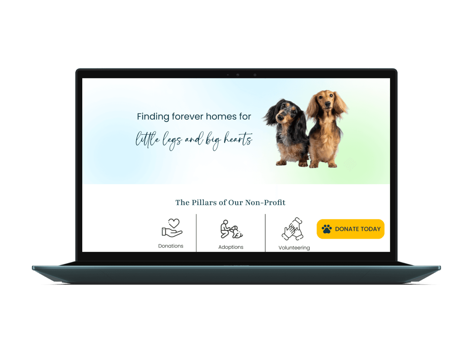
We made the website more approachable with whimsical design featuring soft corners, and pastel colors. We also drove engagement to the donations page with a 140% increase because of our floating donation button.
How might we ensure visitors to the CTDR website are more inclined to donate to the organization?

“The most important pillars to CTDR are donations, fostering, and adoption. Without those the nonprofit can’t survive.”
CTDR Vice President
“I want to donate to non-profits but I never feel like I give enough. I also wonder what the money is spent on. It’s a mystery.”
CTDR Adopter

“I’m most people’s first point of contact. Sometimes my inbox overflows with questions.”
CTDR Volunteer

Interview insights
Other Works
Website Redesign
Sephora
Design Lead | Research | Prototyping
UI Design
(coming soon)