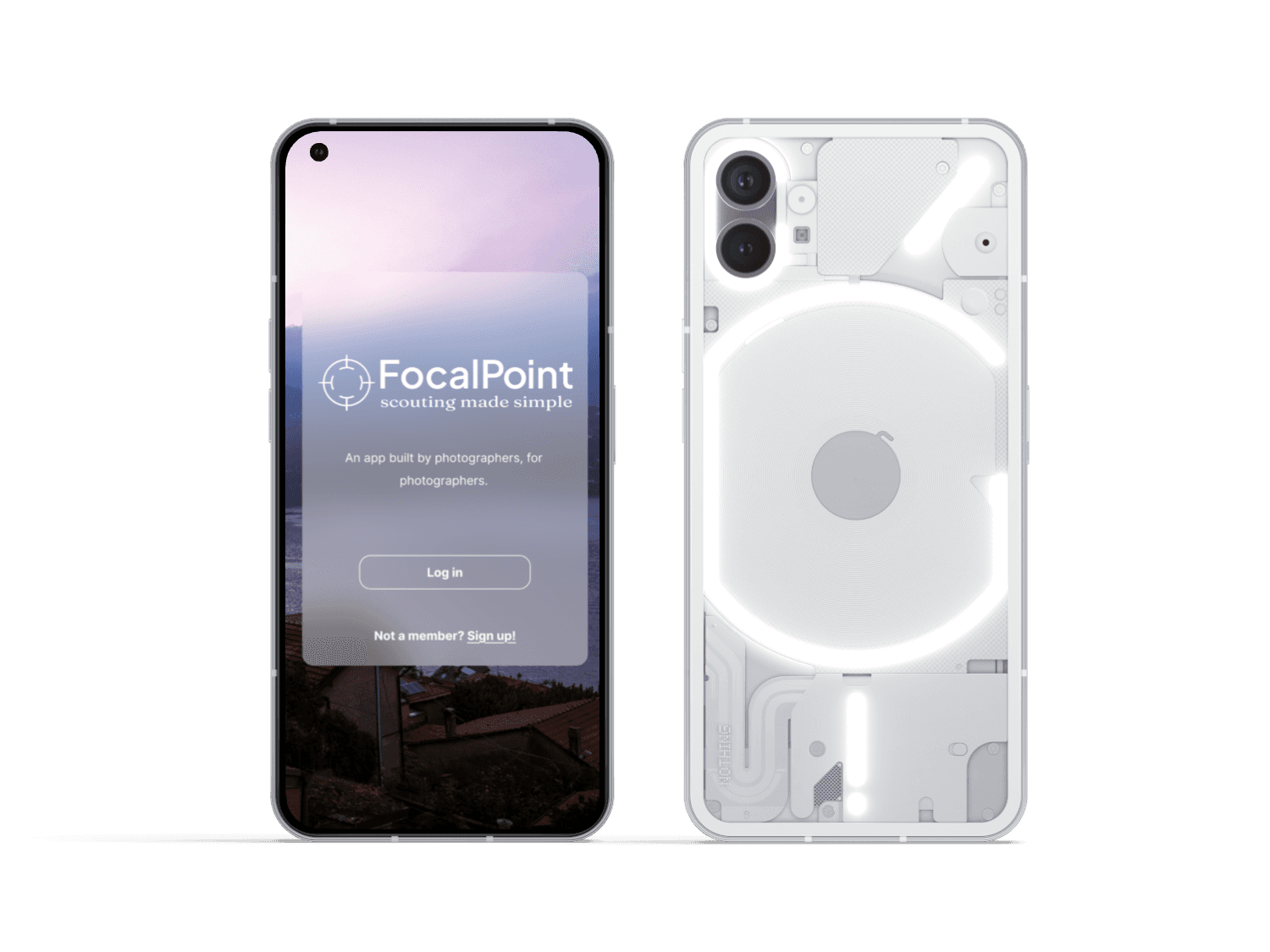
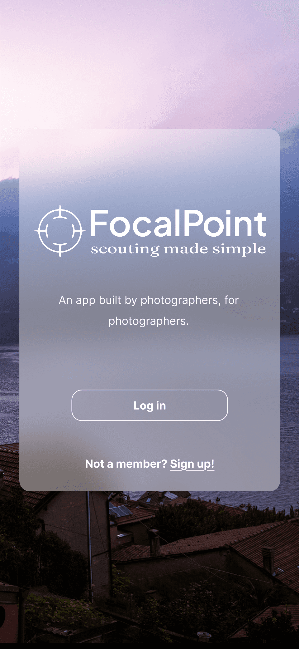
The Solution
An app by photographers, for photographers, that shares geo-location, recommendations, weather advisories, and potential obstacles ie crowds and parking. A best of both worlds with practical advice, and a human touch.
My Role
Lead Designer
UI/UX design
Branding
User research
Research analyst
Tools
Figma
FigJam
Duration
3 weeks
Long Story Short...
An exercise between one designer, and two photographers to create an app that assists in location scouting. Photographers, on average, spend anywhere from 2-5 hours scouting locations in their vicinity for upcoming photoshoots.
The Challenge
Scouting is an essential step for any photographer looking for photo opportunities. Professional, freelance, and hobby photographers all participate in location scouting.
There are limited spaces where professional and hobby photographers can gather to exchange advice and resources about scouting to save one another time.
Photographers feel isolated and without community
The average photographer spends 4 hours scouting new locations

Photographers want suggestions from real people who share their interests
How might we assist professional, and hobby photographers on their journey to scout new locations?
The Process
Secondary Research
Interviews and Surveys
Synthesizing Data
Prototypes
User Testing
Results
Opportunities
Ideation
6 interviews conducted
15 survey responses
Affinity Mapping
Ideate & Group
Create Themes
Group Mapping
MoSCoW Method
Storyboard
User Flow
Persona
Medium Fidelity Mobile App
High Fidelity Mobile App
3 lo-Fi Tests
8 mid-fi tests
13 hi-fi tests
5/5 Satisfaction Rating
Informative with a social media touch
Competitive Analysis
8 articles
Social Media discussion forums
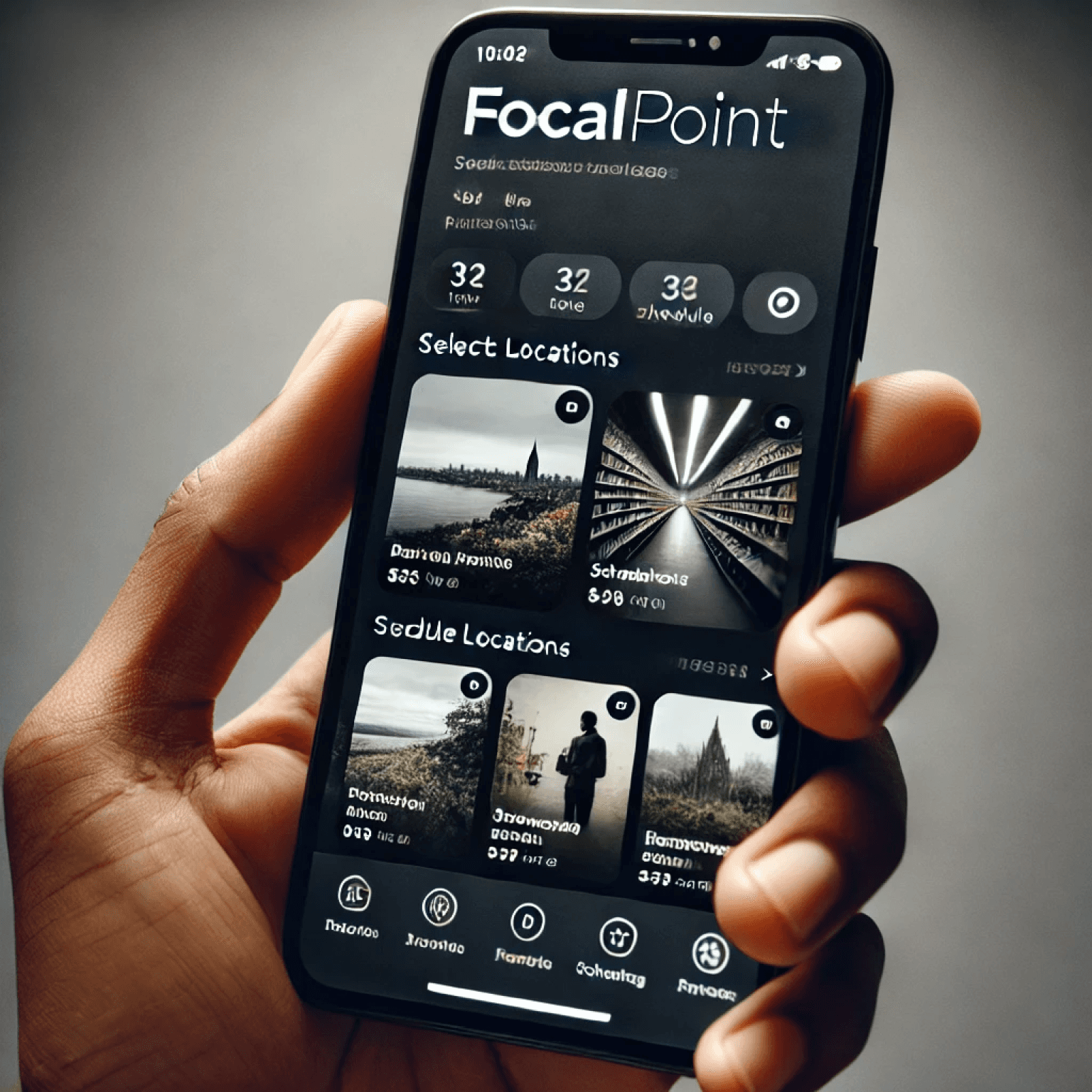
Key Design Features
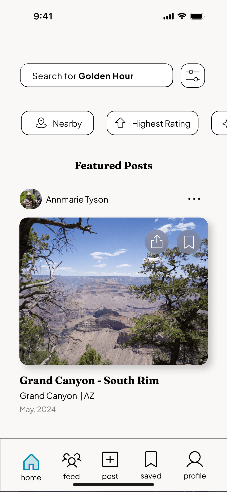
Explore feature to see popular sites in user’s area
Ability to share locations and photos, and build network of photography friends
Social feed with ability to upvote, share, and save locations
Badges for participating with the app
User Needs and Goals
Conducting user research
6 Interviews conducted
8+ hours
secondary research
15 survey responses
Key Takeaways
Market Analysis
Our head of research compiled our team’s notes on 7 apps currently on the market, and the time we spent combing various social media groups and channels for photo scouting. A website was the only existing platform we found that resembled the concept of our proposed app which removes the convenience of mobility.
There are few apps that offer all of the features we are proposing, with the intention our app is set for.
Photo Scouting Apps
Weather tracking
Augmented reality
Pay Walls
No recommendations for new locations
Social Media Groups/ Forums
Community driven
Recommendations for new locations
No weather tracking
Disorganized
User Storyboard
The Problem
No centralized place for photographers to share advice
Photo scouting is time consuming, and not possible when a photographer is out of town
Scouting apps on the market provide weather and sun/ moon tracking but photographer already needs to provide geo-location.
The Solution
An app with specific guidelines, and language to assist users when scouting and giving advice
Reduce time scouting by providing photographers with leads on their phone. Perfect for on-the-go, or stationary research.
Our app provides new geo-locations for our users based on community recommendations.
Our team focused on ensuring the app’s user flow was intuitive. Since there is not other app like this on the market, we had to ensure we stood out both as s tool and a networking platform. Every user test measured task completion to ensure a first time user could easily navigate the different pages, and filtering options.
From Ideas to Interface
The Design Process
Our goal is to build community amongst photographers, and provide a resource for professionals, and hobbyists alike.
User Flow & Paper Wireframes
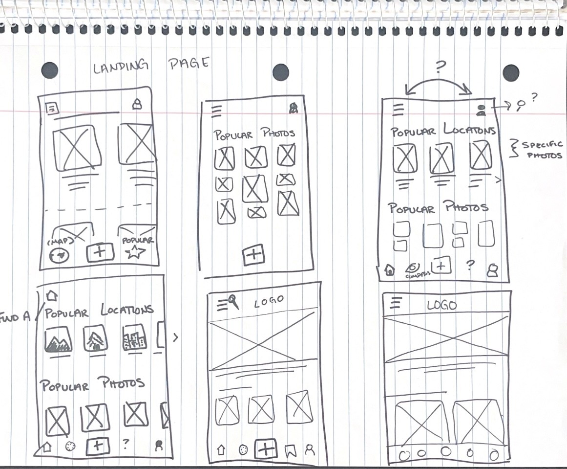
Low Fidelity Wireframes

As lead designer, I began crazy 8s, and wireframe sprints while my team analyzed the incoming data from interviews, and survey polls we’d conducted.
Due to our fast approaching deadline, I created wireframes that were approved by the team, and began testing flows as early as possible to get us on the right track.
Testing the first user flow
Potential User Flow #1
Potential User Flow #2
Lorem ipsum dolor sit amet, consectetur ad Lorem ipsum dolor sit amet, consectetur ad
Join Our Monthly Challenge
Popular Categories
Proposals
Graduation
see all
Popular Photos
see all
see all
Meet the Community
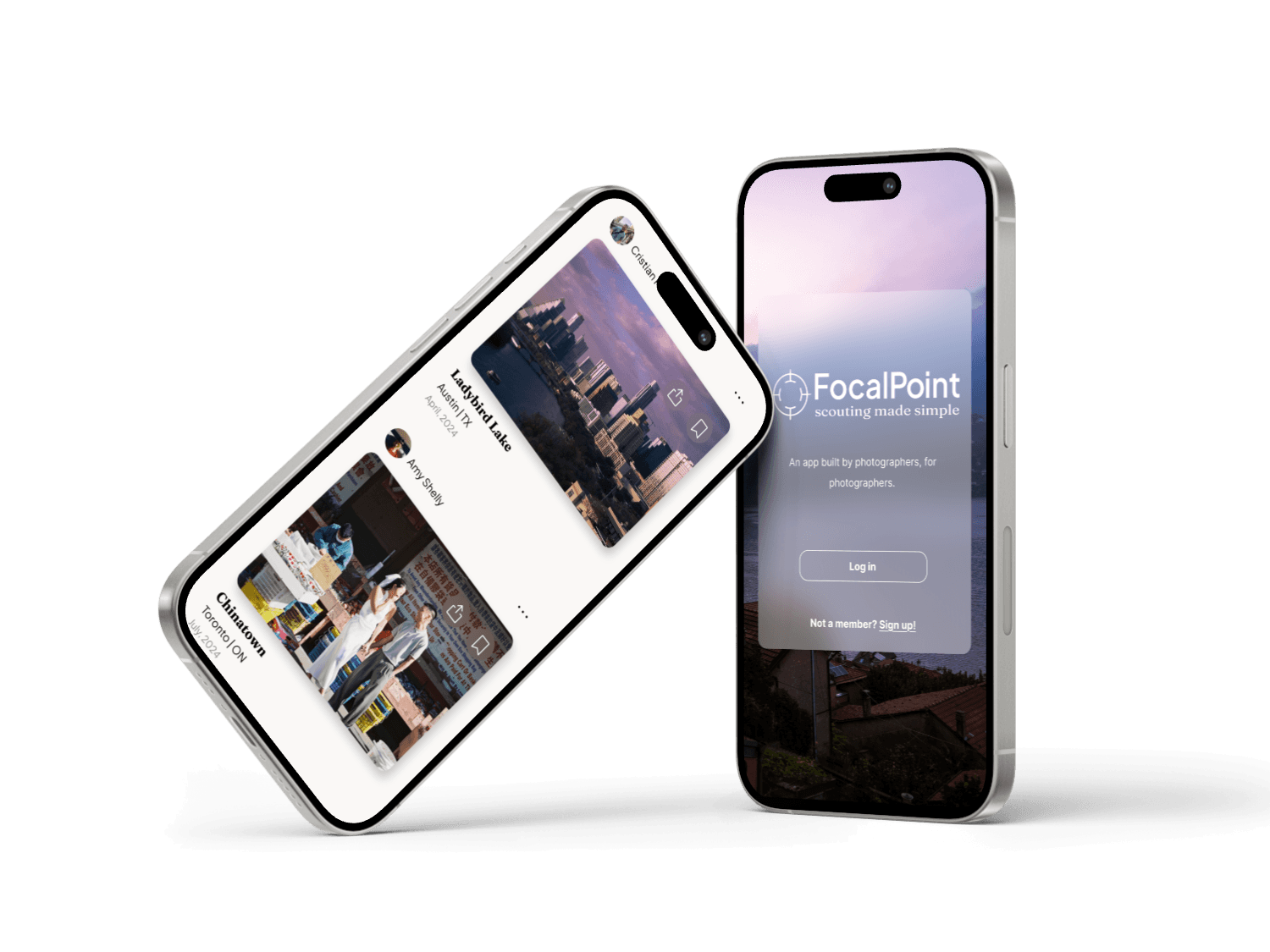
FocalPoint
Lorem ipsum dolor sit amet, consectetur ad Lorem ipsum dolor sit amet, consectetur ad
Join Our Monthly Challenge
Popular Categories
Proposals
Graduation
see all
Popular Photos
see all
see all
Meet the Community
FocalPoint
see more
Proposals
Urban/ Cityscape
Water?
Landscape
Graduation
Popular Categories
FocalPoint
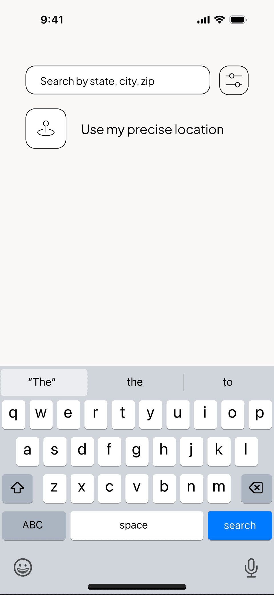
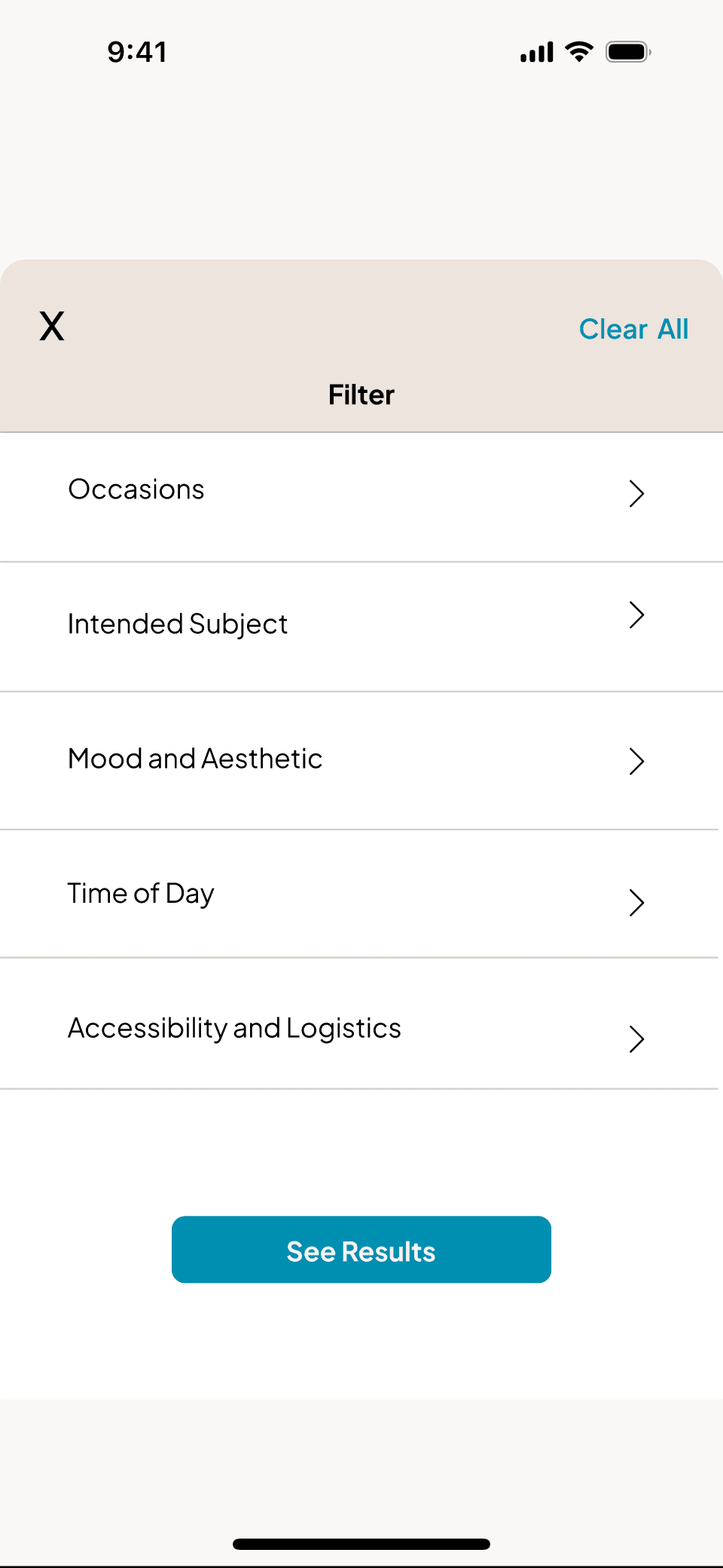
Search By Keywords
Select Filters
Label
Label
Label
Label
Label
Label
Label
Label
Label
Label
Label
Label
Label
Label
Label
Search
FocalPoint
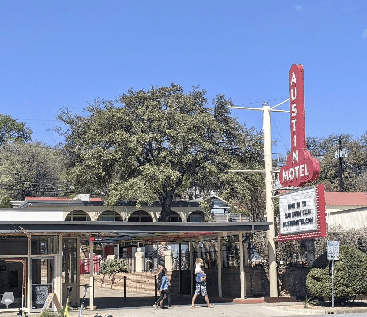
Austin, Texas


Featured Photos


+1
Popular Categories
Proposals
Graduation
see all
FocalPoint
USE MY LOCATION
Search by zipcode
FocalPoint
USE MY LOCATION
Search by zipcode
Allow FocalPoint to use your location
Allow Once
Allow While Using App
Don’t Allow
Austin, Texas
Featured Photos
+1
Popular Categories
Proposals
Graduation
see all
FocalPoint
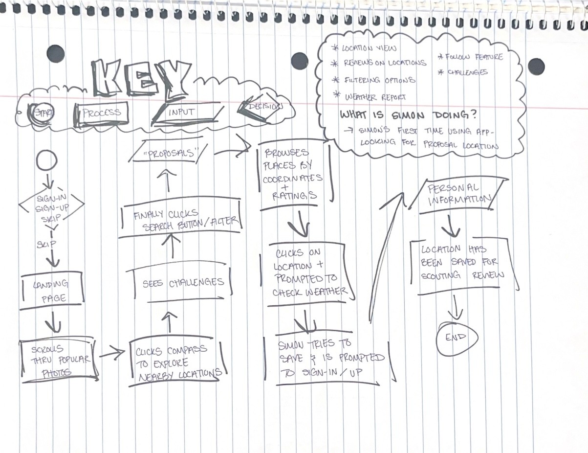
User scans homescreen
User scans homescreen
User selects “compass” button in navigation
User is prompted to share location
User sees posts based on location
User selects “popular categories”
User choose filter options
User is shown popular categories all over the world
We wanted the homescreen to facilitate the goal of the proto-persona: find areas for a proposal photoshoot
Users wanted more autonomy and to explore the social “feed” rather than immediately begin scouting
We had to make the homescreen more inviting and less goal oriented. We wanted the homescreen to inspire users, not funnel them into new tasks.
The Magic
The Decision
The Setback
Medium Fidelity Wireframes
Nearby
Highest Rating
Newest
Hidden Gems
Highest Rating
Newest
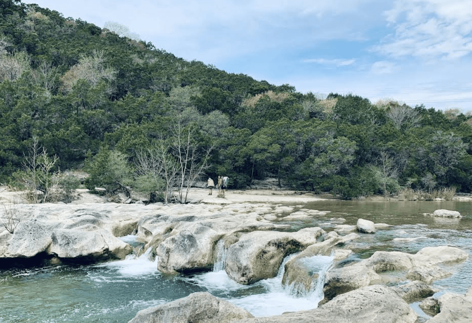
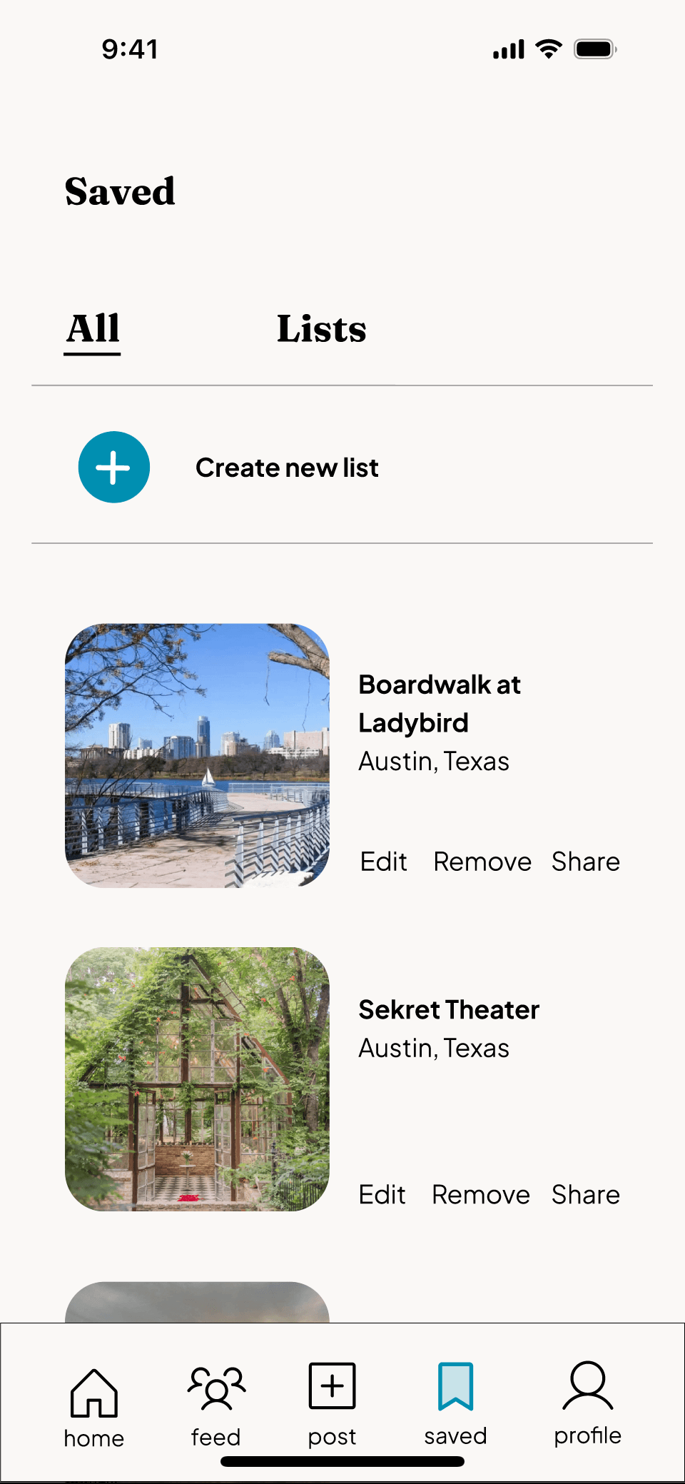
Boardwalk @ Ladybird Lake
Barton Creek Greenbelt
Concan
Details
Details
Details
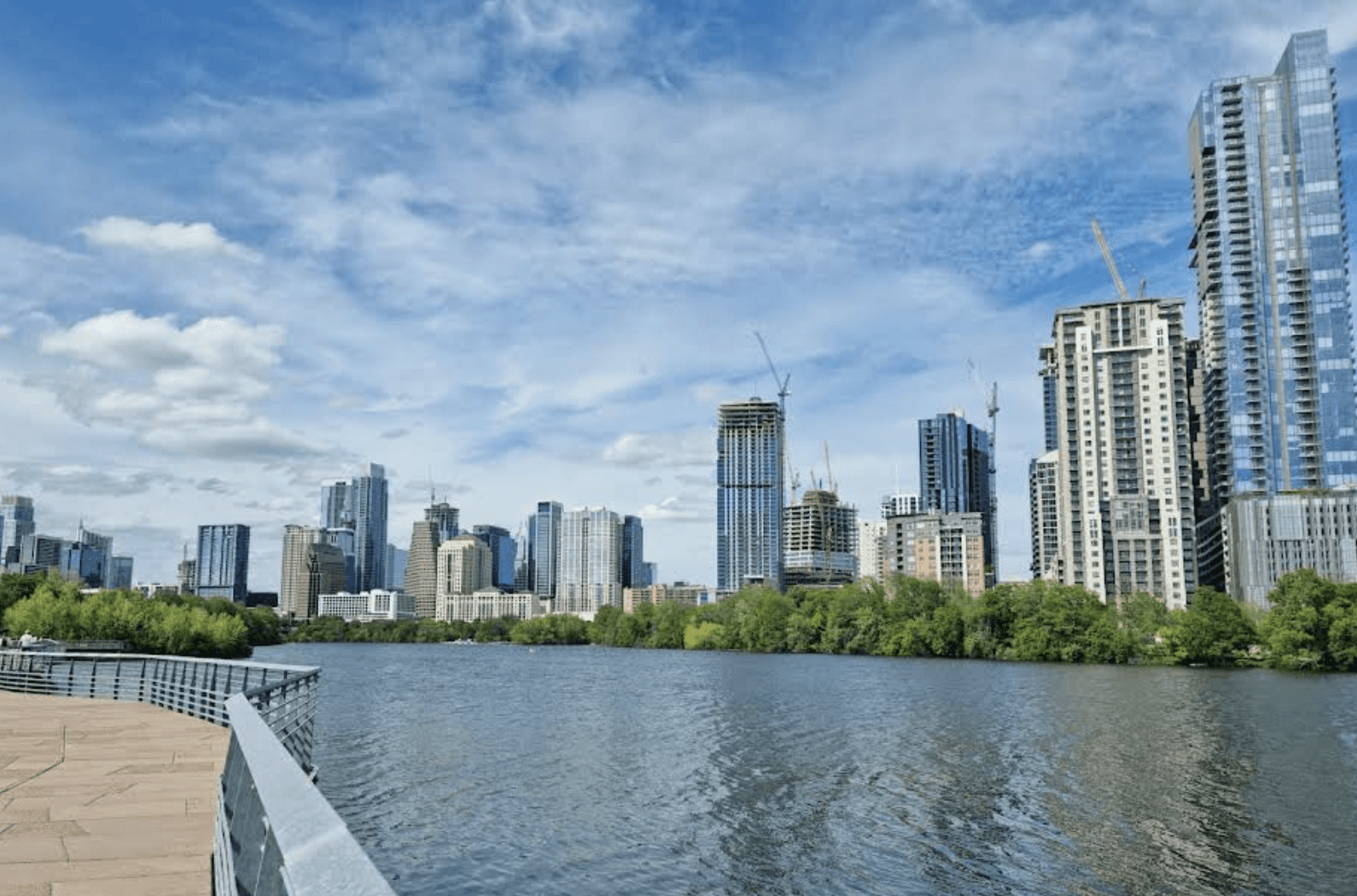
Austin | Texas
Austin | Texas
Austin | Texas
3,412
989
457
South Congress Ave.
Enchanted Rock
Details
Details
Austin | Texas
Austin | Texas
1,146
1,146
Find hidden gems (etc)

Lake Austin
Details
Austin | Texas
2,002
Austin, Texas
Show All
FocalPoint

9:41
Early wins
Our second user flow was perfection!
Task completion at 100%
Compliments on the organization of the app
Test subjects from ages 18 to mid 50’s found our flow was intuitive
Unable to read card text.
Unsure if the app is a social platform, or an AI companion assisting with scouting.
Weak branding with testers reporting the app was not memorable aesthetically
Improvements needed
We wanted the app to feel equally like a technical tool for planning, and have a community driven social media feel.
The app felt too “robotic” - our generically written posts for filler text was one of the main callouts.
We made the app warmer by updating the home screen with avatars to reinforce the social media feel.
We even had our UX team members write their own posts since they are photographers.
The Magic
The Decision
The Setback
Scouting
Photographers spend hours driving around aimlessly looking for potential locations to shoot.
4/5 photographers are expected to choose the shoot location when working with clients
Barriers
Interviewed photographers said their largest hurdle is finding spaces that aren’t private property.
Common obstacles include private property, crowded places, paid parking/ entry fees they weren’t aware of.
Word of Mouth
Most interviewees have friends who share their profession or hobby, but no organized way of sharing tips and recommendations.
“Any other time I’ve gotten inspiration it’s been mostly from close friends”
Social media channels, and groups for scouting become disorganized.
Groups for photography scouting are overrun by photographers looking to sell services, or equipment.
Social Media
Accent
#8EDCE8
Accent
#E3F8D1
FocalPoint
Mobile App
Main
#008FB1
Main
#FAF8F6
Secondary
#0F1720
Secondary
#FF7F50
Headline 1 size 24 - Fraunces Bold
Headline 2 size 16 - Plus Jakarta Sans
Body 1 size 16 - Plus Jakarta Sans
High Fidelity Design System
Design DNA
Our apps two main colors reference Golden Hour (sunset) and Blue Hour (just before sunrise/ after sunset). Two of the most desirable lighting conditions for photographers.
Further, the blue lends itself to competency and professionalism since the app is a tool, while the warm orange tones callback to the community that makes the tool possible.


9:41
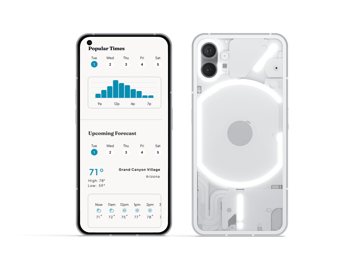
Before You Go
We wanted the app to appeal to novices, and seasoned photographers alike. We included helpful user-written tips, a weather modal, and “busy” times modal for planning ahead.
The questionnaire prompts are based off of real photographers most common obstacles when shooting.
Social Media Forward
Our team heard the callouts that our app looked stale, and computer generated and met the challenge with smiling faces - literally.
We made sure account avatars were ever present so users knew they were looking at another photographer’s post.
9:41

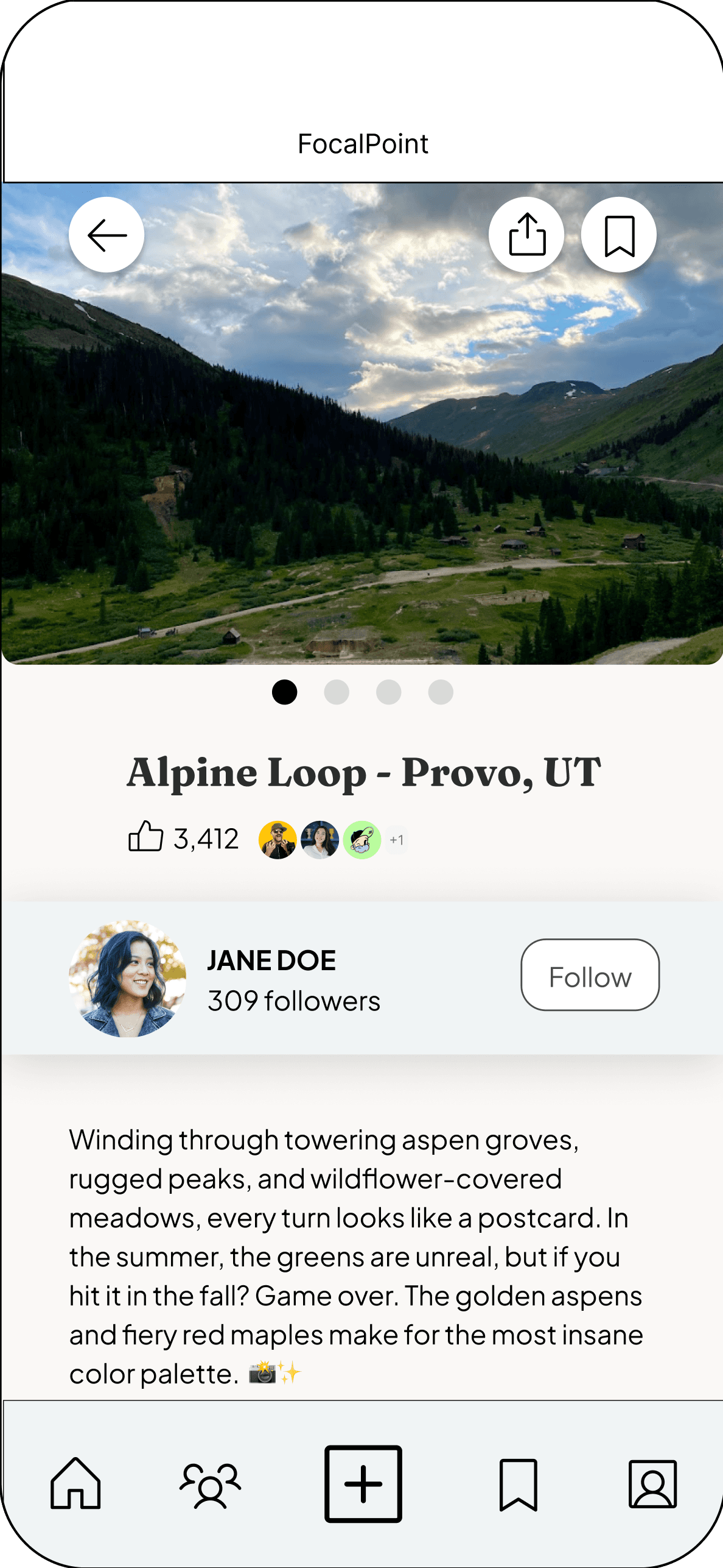
Where to Next?
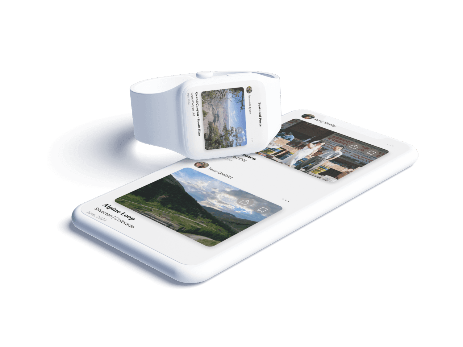
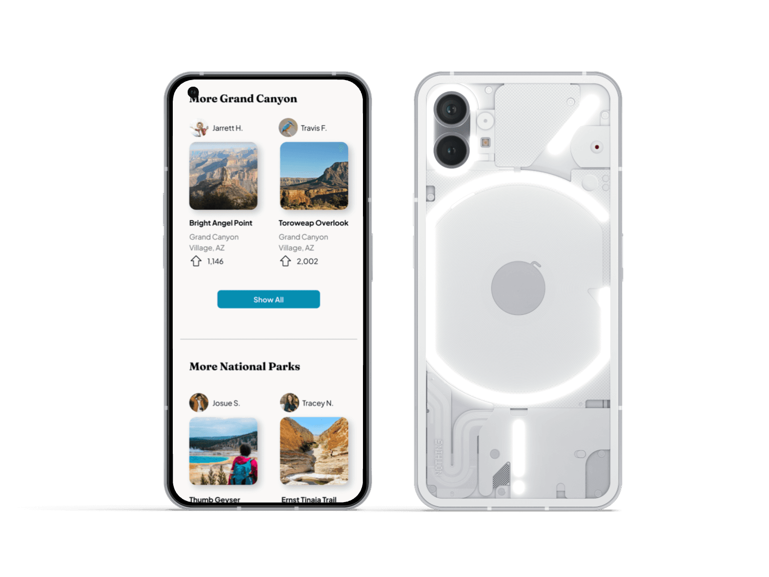
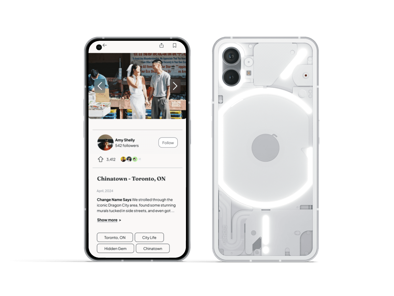
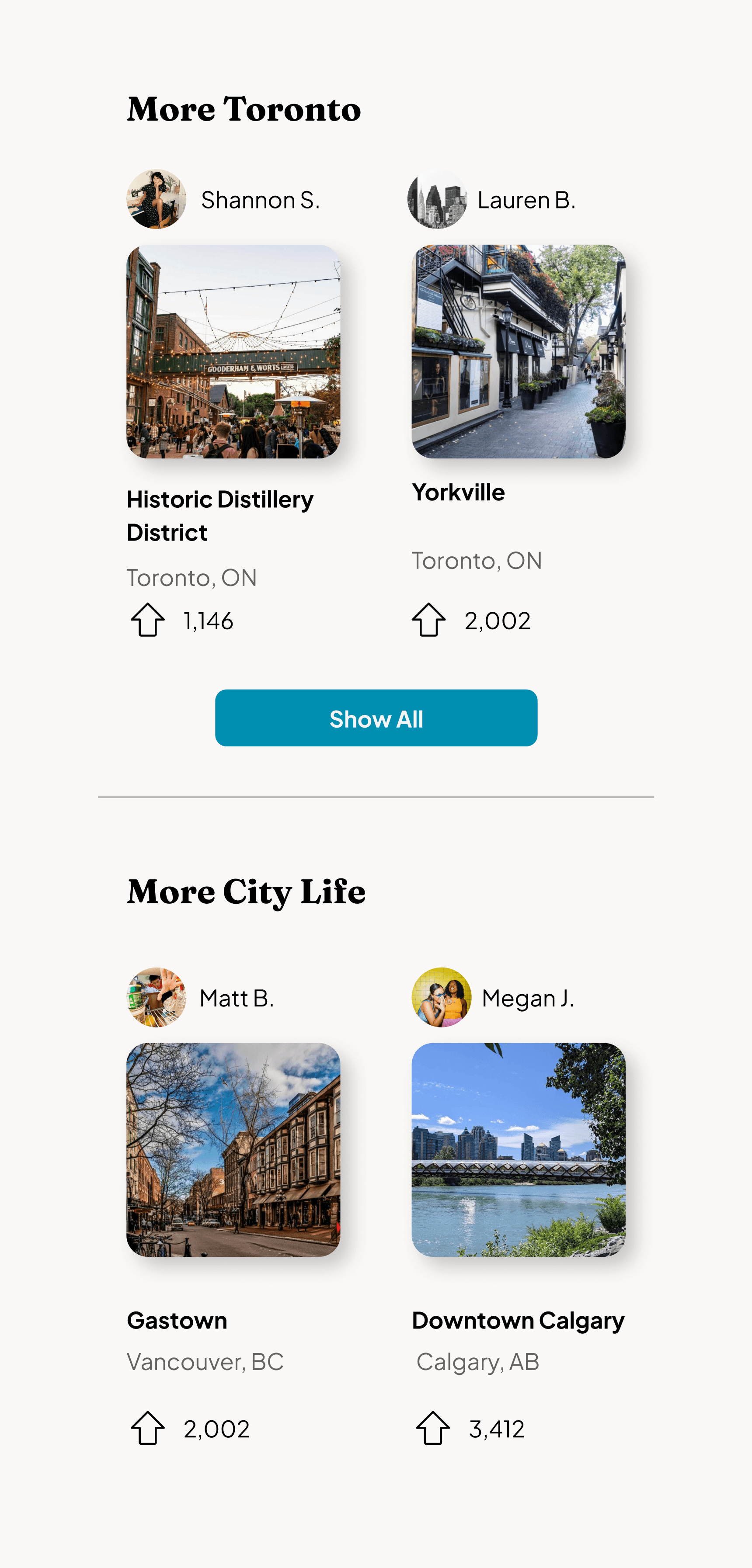
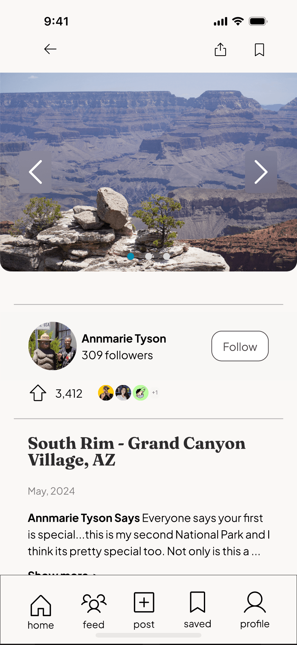
Our app wants to expand on our user’s interests. If they’re traveling to the Grand Canyon, or another National Park, next week we want to give them ideas.
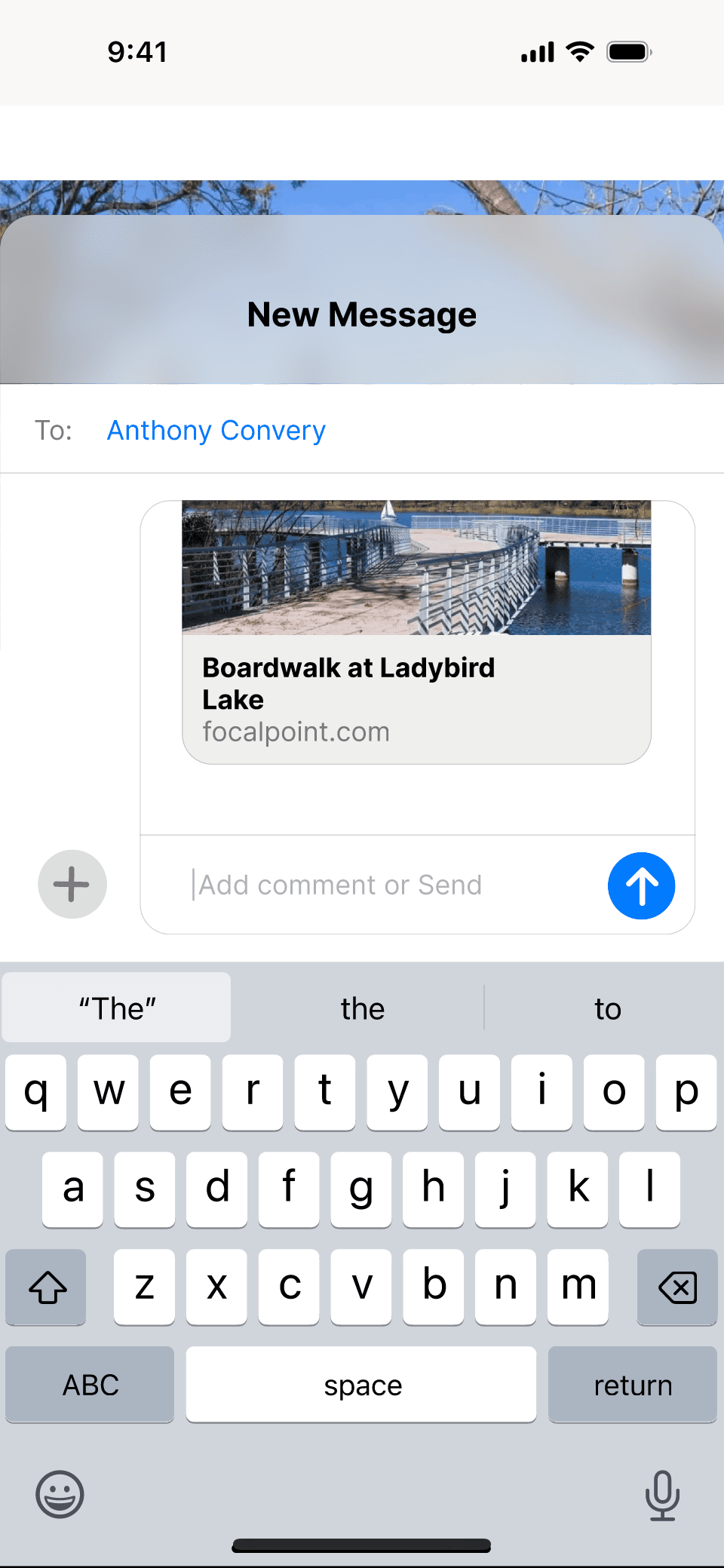
Each post features a related section at the bottom suggesting users “See More...”. This section helps our users Scout and Save.
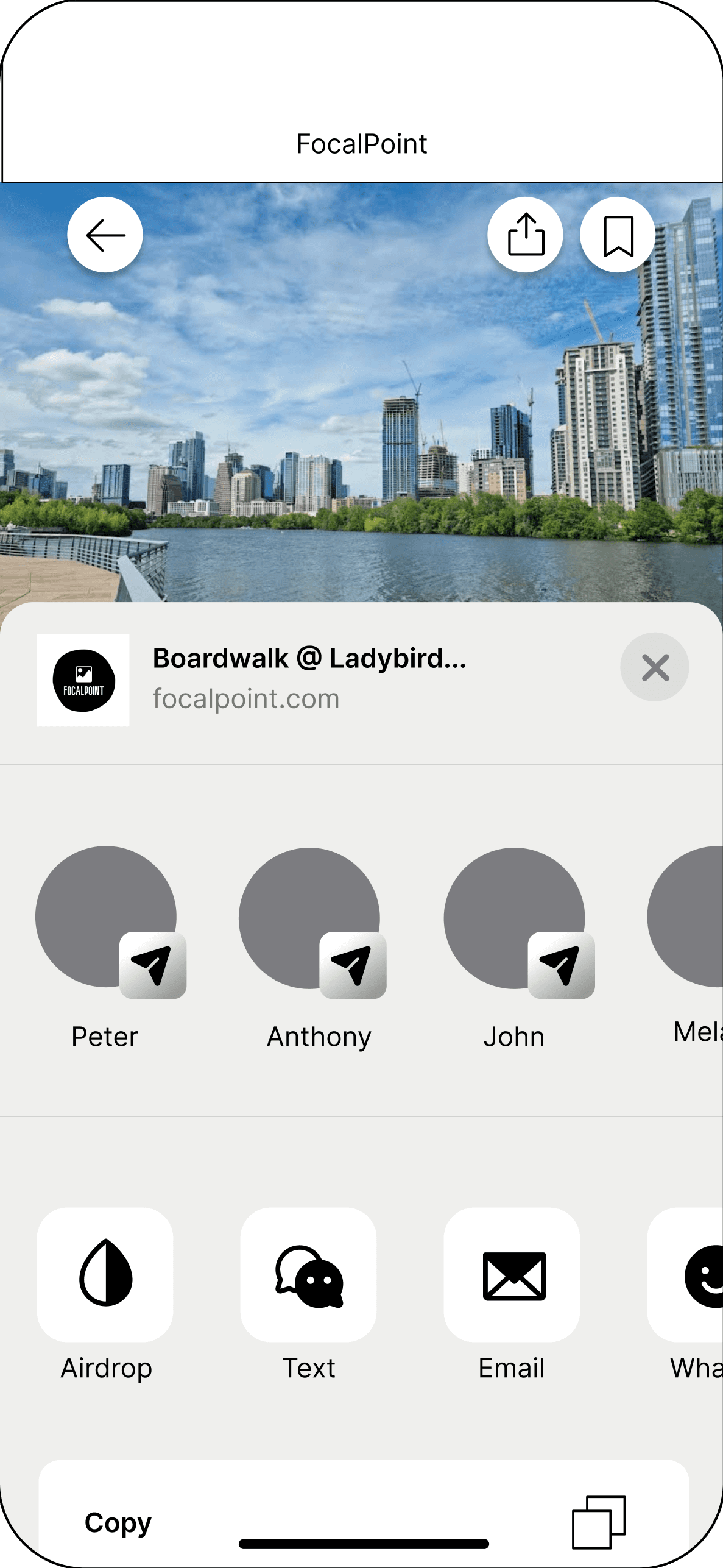
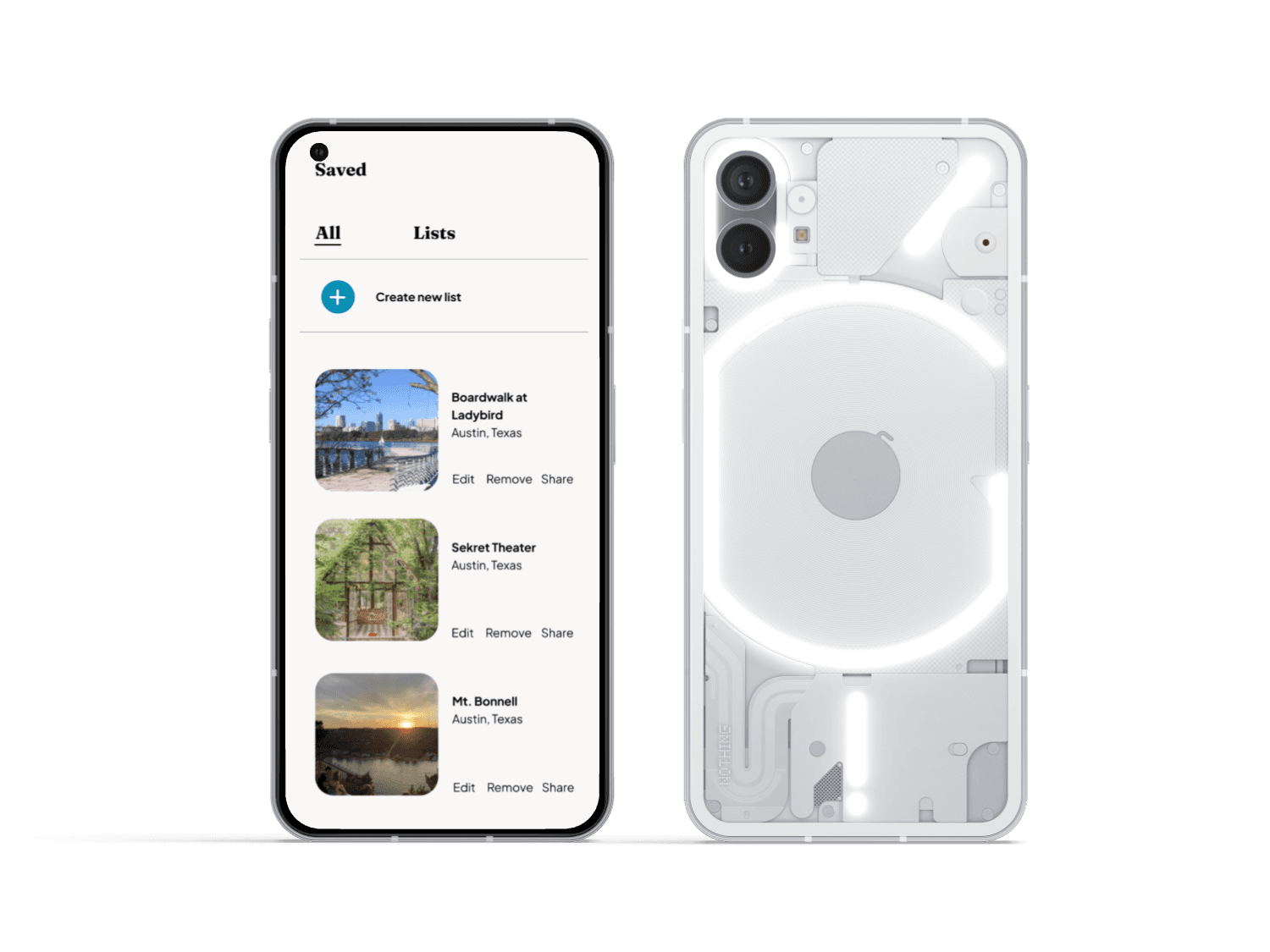
Scout and Share
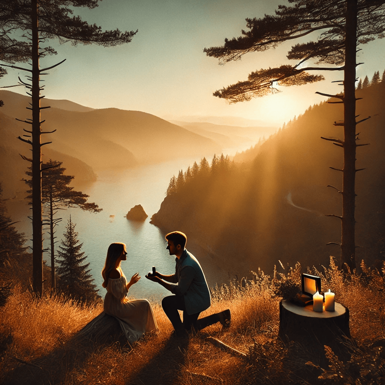
Our persona was based on a fellow team member being hired for a proposal shoot - only one problem: he’d never seen the venue before.
The ability to share with friends allows everyone to feel more prepared. Especially if a photographer cannot see location before the big shoot.
Results and Impact
Based on all user feedback, this app would be a valuable tool in the photographer lexicon. We laid the foundation to bridge the gap between a tool for location scouting, with an organized social media element that drives information.
While this app remains in concept stage, it reflects a validated solution with strong usability outcomes and scalable potential.
5/5 user satisfaction with regard to overall design, and concept
Successfully addressed photographer scouting fatigue
Advanced filtering options currently unavailable on the market
Reflection
If I could go back I would have used a design system, template, and UI kits. I built every component, variant, card etc from scratch and could have saved so much time building on ideas and flows while keeping the wireframes more simple and compromising on the style.
Ultimately 3 weeks is incredibly short, and I should have pulled back on perfecting a couple of small features, and built an app with more wireframes, and a “rough-and-ready” look that wasn’t so polished. That way our team could show more concepts and ideas we had.
TLDR: I should have used a design kit to expand our wireframes and features rather than create everything myself due to the short timeframe.
What did I learn from the process and what would I change?
Done is Better than Perfect
Other Works
Mobile Application
Houndstooth
Design Lead | Research | Prototyping
Design Lead | Concept | Research
(coming soon)


Final User Flow
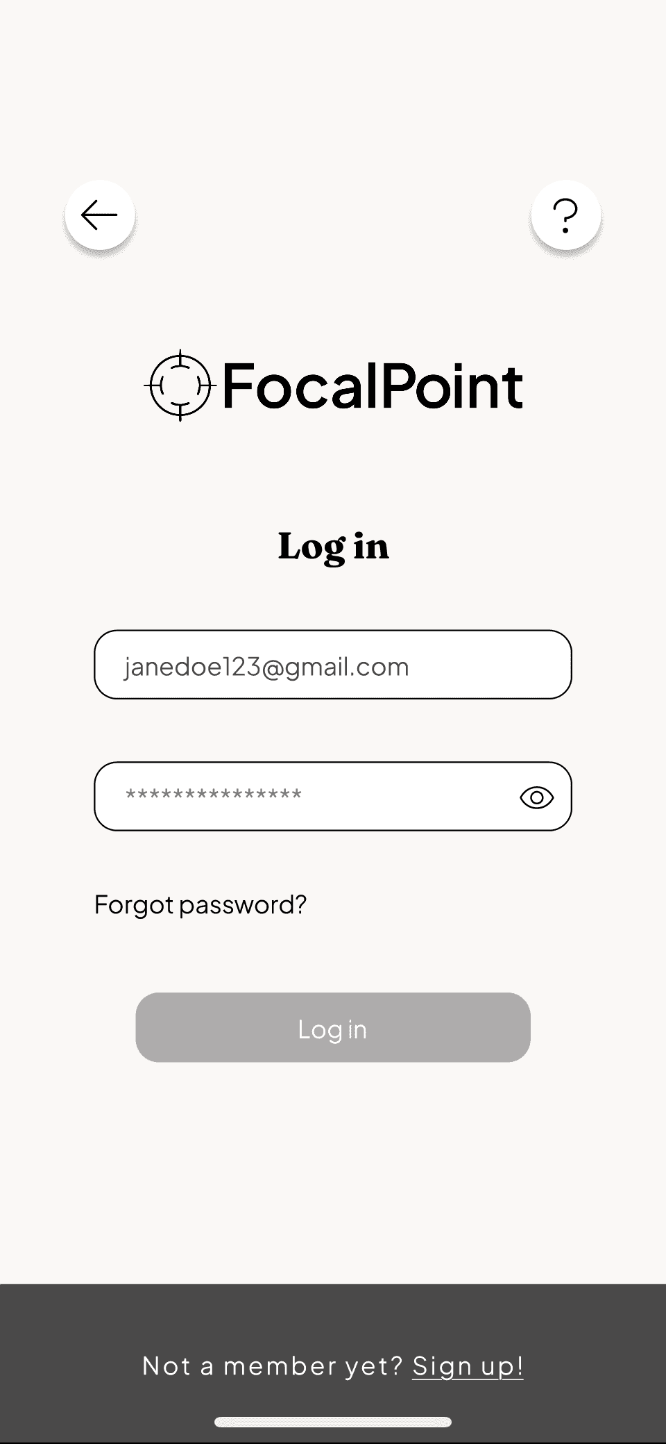
User onboarding
User logs in/ signs up
Home screen
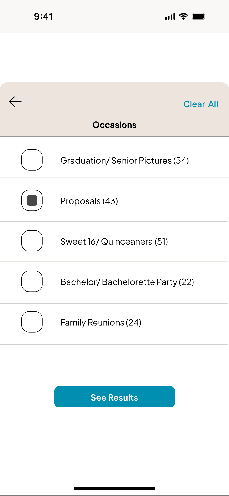
Filtered feed under “occasions”
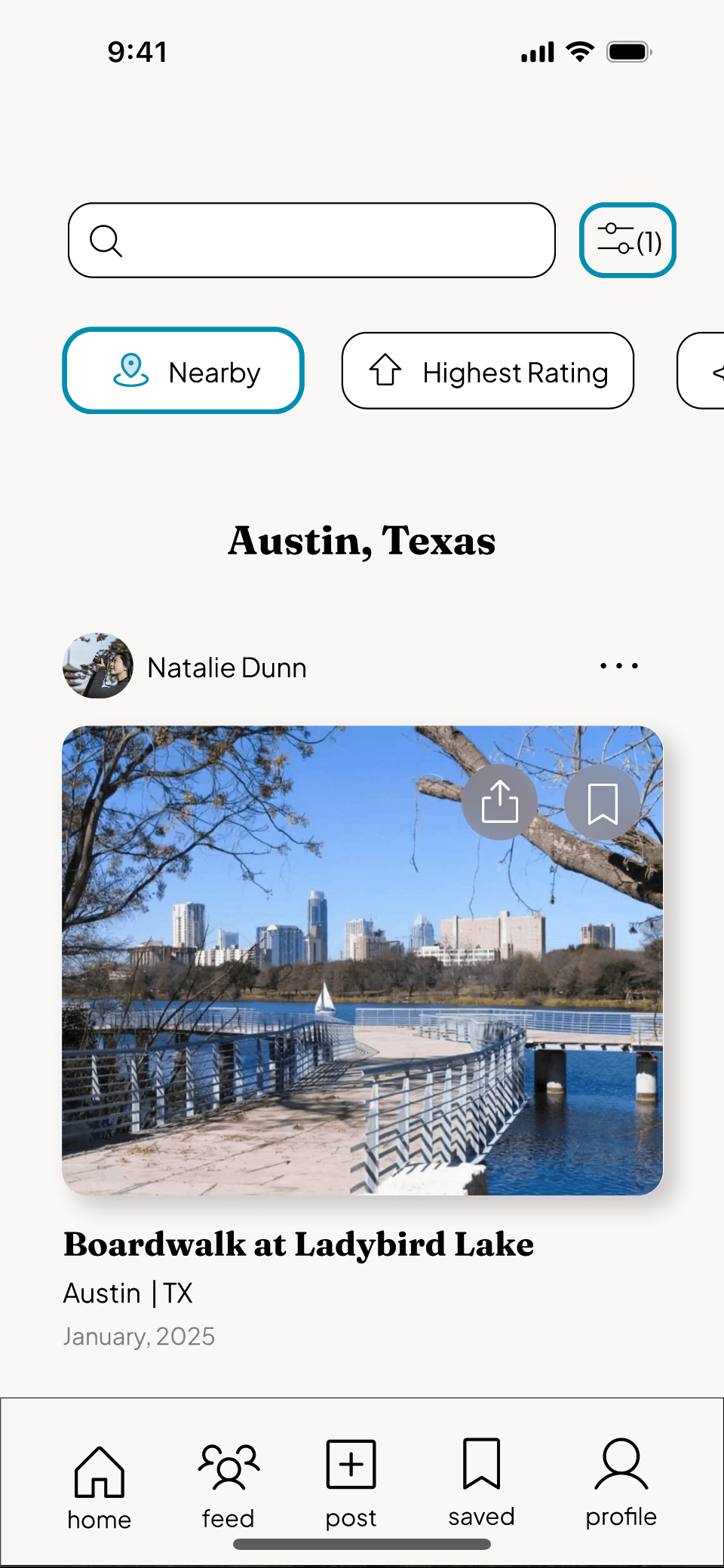
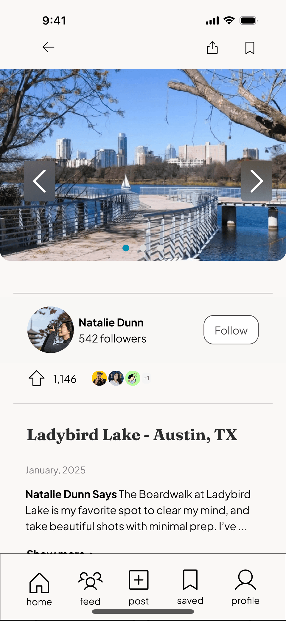
Natalie’s post
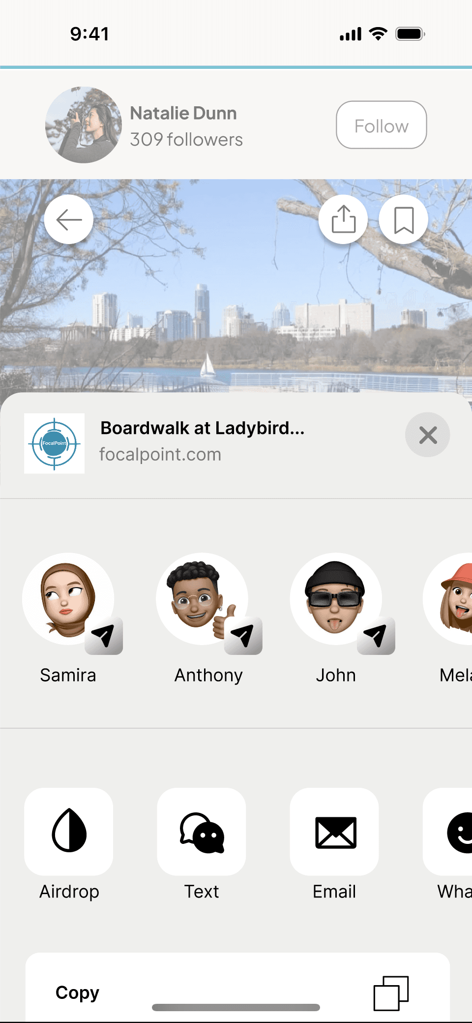
User saves post, and sends to a friend
Sends post to friend
After sharing is complete, user returns to post
“Austin, Texas” Feed
Filtered options
Selected filter options
Bookmarks/ Saved posts
Chooses first post on feed
Search: “Austin, Texas”